Gheorghe Pîntea · Graphic Designer
08
Campaigns
11
Posters
2026
Year
Eight campaigns. Eight briefs. One rule applied to all of them: the viewer must feel something before a single word registers. Emotion before information. Concept before craft.
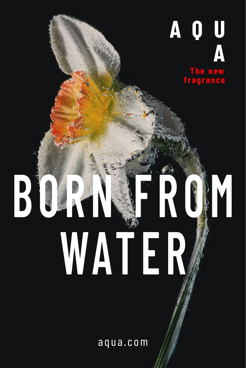
Two iterations. Same image. Opposite type decisions. One dominates — one withdraws. Both are correct.
Portrait format maps to how people consume content today — stories, reels, outdoor billboards. The crop holds at any size because it's anchored by a single object against void.
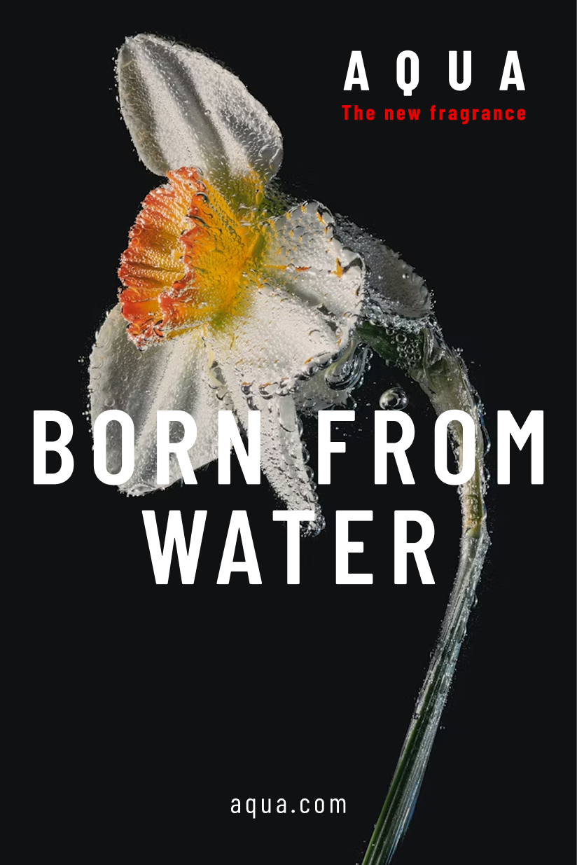
A single daffodil against void. The fragrance is implied before a word is read. V1 maximises type presence — V2 lets the image breathe. Not two versions of the same poster: a conversation about how much a headline needs to announce itself before it loses elegance.
Three posters. One idea repeated until it becomes a chant. Electric blue. Nature as urgency, not decoration.
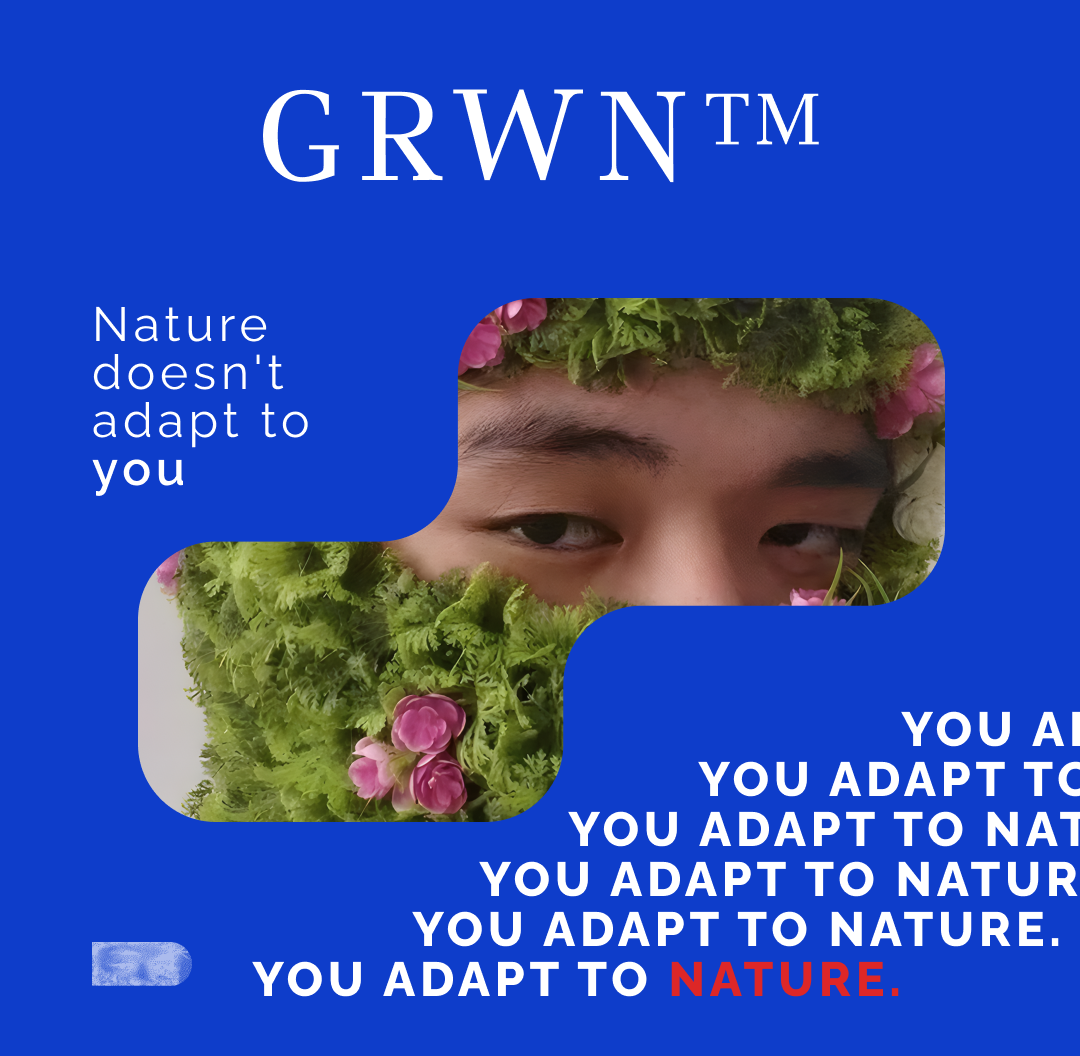
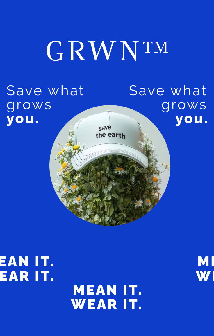
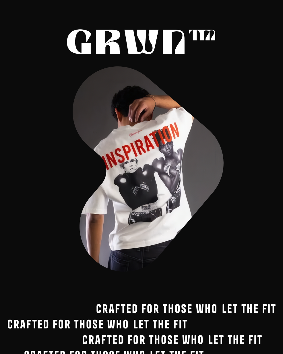
The cobalt blue reads like a road sign — a warning. The phrase repeats across all three formats: by the fifth repetition, you believe it. Manifesto, product, lifestyle. Together they form a visual identity system, not three separate posters.
SS26. No rules. A magazine spread that escaped the page and became a billboard. Monochrome. Direct.
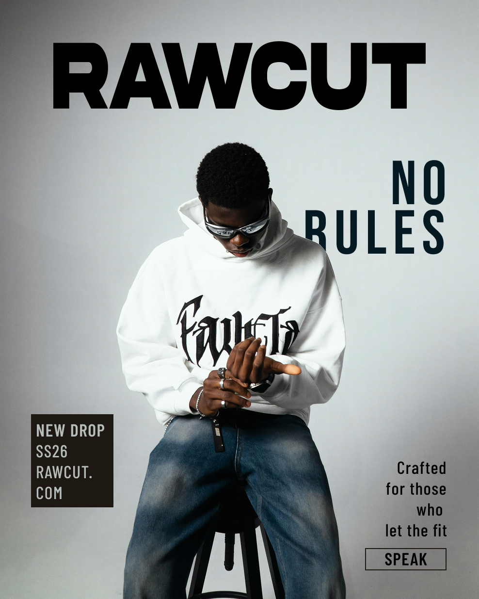
Grey studio, oversized hoodie, type set in editorial columns that break the grid on purpose. The double-column structure is borrowed from fashion editorial — it signals craft before the reader processes a word. The layout gets out of the way and lets the garment speak.
Romanian fashion label. Limited summer collection. Golden hour, fabric in wind, script that leans like handwriting.
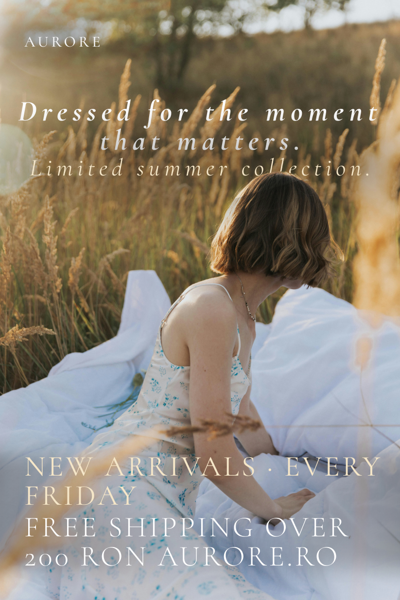
Quiet luxury doesn't announce itself. The script headline leans slightly — like handwriting, not branding. Supporting text is tight and informational. The photo is the poster. Typography serves context, not ego.
Handcrafted jewelry. The person is the brand. The jewelry is proof. Portrait-driven, direct, unapologetic.
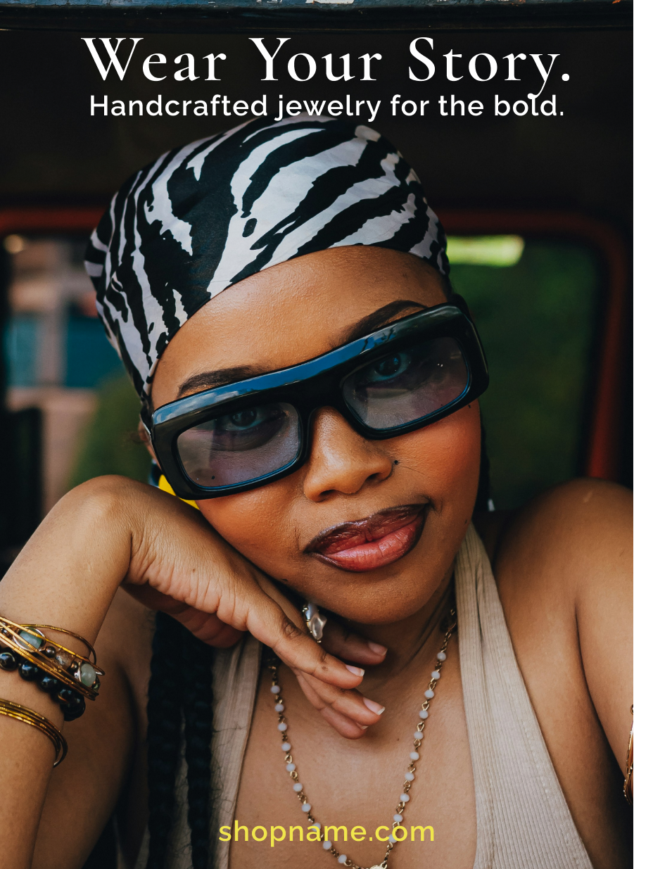
The subject holds the entire frame. The headline lands in the negative space above the eyeline. Serif headline against light italic sub mirrors the jewelry: hard edge, delicate detail. Every element is working.
Two events. Two opposite energies. Same function: announce, excite, drive action.
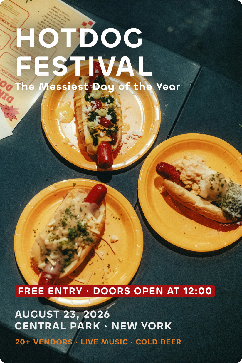
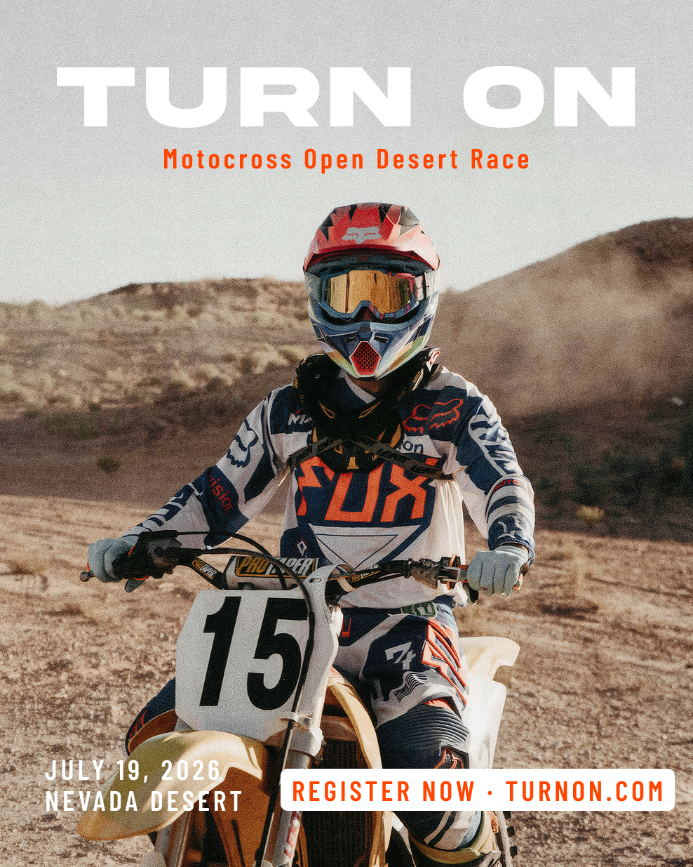
Both solve the same brief through opposite visual languages. Festival: warm overheads, condensed caps, information stacked like food orders. Motocross: the rider holds you, date and CTA bracket the frame. Eye path on both: title → emotion → action.
Built in the dark. When no one's watching. Black-and-white. One red. Locker room silence before the game.
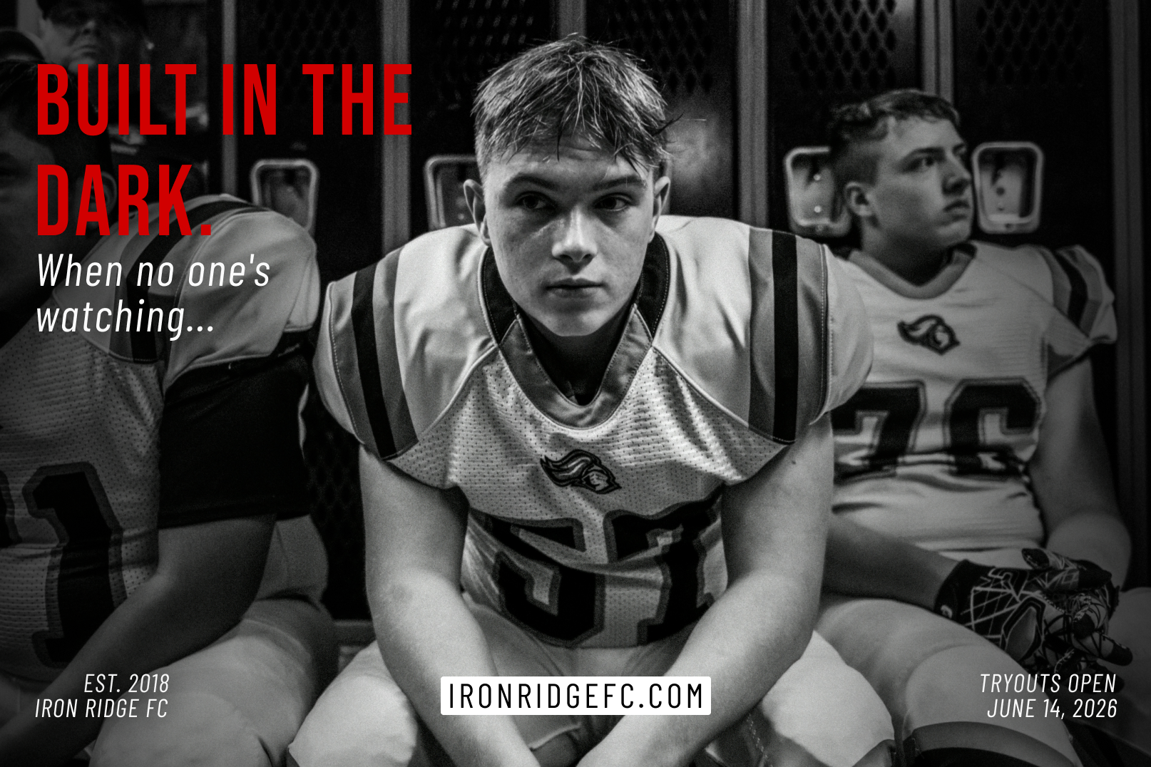
The red headline is the only colour in the frame. One punch. Everything else is grey — the locker room, the players, the weight of expectation. The landscape format breaks the portrait-dominant series deliberately. Cinematic. Immovable.
Colour is chosen before typography. Before layout. It sets the emotional register of everything that follows.
Black as void. The absence of colour is the fragrance itself.
Electric blue as environmental alarm — impossible to ignore.
Monochrome removes distraction. The fit is all that remains.
Golden-hour tones signal softness before a word is read.
Warm skin tones ground luxury in the human body.
Warm primaries signal celebration — fast, loud, inclusive.
Dust and rust — the palette is the landscape.
One red. Everything else earns its place in grey.
Typography is the invisible structure that holds every poster together. Scale, weight, and tracking are functional decisions about where the eye goes next.
Graphic designer specialising in poster design, brand campaigns and visual identity. Eight campaigns built around one principle — the viewer feels before they read.
Poster design, brand campaigns, visual identity. If you have a brief — or just an idea — I'd like to hear it.